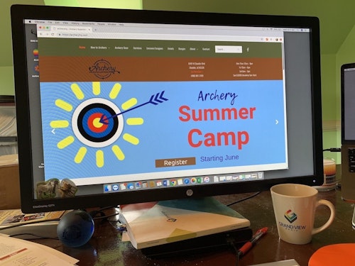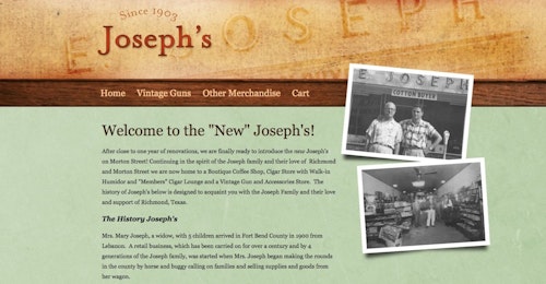
Photo: scyther5 (iStock)
Having a website is a necessity for businesses in today’s age. But not all websites are created equal. Some work to convert, while others leave potential customers frantically hitting the back button in their browsers.
How do you create a website that works on your behalf and provides value for you and those searching for your services? What does your website need to have on it if it’s going to work for you to close leads you haven’t yet heard from or met?
Let’s take a look at some of the fundamentals:
1. Contact Info That’s Easy to Find
Whether a prospect has landed on your homepage or on one of your internal pages, they should be able to easily identify exactly how they can reach you.
When your prospects are looking for the services or hunting-related products you offer, chances are they’re time-pressed and frustrated as is. Don’t make them jump through hoops or search high and low for your phone number, email address or physical address. Make it easy for them to take that next step.
One of the best ways to do this is to put your phone number and email address in the upper right corner of the website, or somewhere else where it can be easily spotted from every page. You should also have an easy-to-find "Contact" page in your menu.

2. List of Services
When a potential customer lands on your website, the first question they have is, “Can you help me?” You need to make it clear exactly what product categories you stock and what services you offer.
Do this by including a list of services you offer right there on your homepage. You should also make sure your site menu includes those services and makes it easy for searchers to navigate to the pages that are most relevant to them.
Remember, your site should never be an obstacle course. It should clearly present the information potential customers need in order to take action.
3. Personality
We’ve all heard it said that people do business with people they know, like and trust, and we all know it’s true. So isn’t it unfair for us to expect our potential customers to choose us when they know nothing about us other than our names, logos and contact info? Showcase your business on your website, and give people a reason to like and trust you.
One way to do this that also works to capture attention right away and keep potential customers on the page longer is to add an intro video to your homepage. Don’t just make some sales-pitch-heavy, high-production video that comes off more like a commercial. Really show them who you are. Include your face and the faces of your team members. Include the faces of happy customers, if you can. And show them what your company is about, what you do differently from the competition and what they can expect when they work with you.
It’s smart to include testimonials, instructor certifications, trade group and association logos and other trust-building signals on your homepage.
You should also make use of your “About” page by providing photos and bios for each of the team members your potential customer may come into contact with.

4. Helpful, Informative Content
Your Google My Business profile already tells searchers some of the basics, so if a prospect has made it to your website, there’s a good chance they want to know more. They may not be ready to call you or feel fully confident you can address their problem. They may not even really know what their problem is yet.
Use the pages on your website to educate them and provide meaningful, helpful content they’ll actually want to read (i.e., information that provides value and gives them confidence you can solve their problem). The more questions you can answer with your website content and the more confident your prospects are that you’re the right company for the job, the better that initial call will be.
5. Photos That Serve a Purpose
Just like content for content’s sake is a waste, adding photos that are irrelevant or meaningless to your website is a waste. Use your photos to sell your product, services, expertise and your team. Strategically choose photos that show your shop and retail floor in the best light, and showcase the professionalism of your team.
Photos don’t have to be professional, but they should be crisp, clear and purposeful. You may also want to include captions because your prospects won’t have the same technical knowledge you have and may not know what they’re looking at.
6. Call to Action
While your website content is there to educate searchers and provide value, it should also tell potential customers what to do next. That’s where your call to action comes in.
Every page on your site should have a call to action, which is usually a call to stop by the shop or schedule a service such a bow repair. You’ve already provided helpful information and value. You’ve already built trust and assured them you can help solve their problem. Now ask them to take that next step and make the call or click.
One More Quick Note
Of course, you also want to make sure your website is mobile-friendly and looks good on every type of device. If your website is difficult to navigate and your prospect has to pinch, scroll or flip their phones repeatedly in an attempt to view the site in its entirety, nothing else we’ve talked about will matter.
Today’s consumers are searching on the go, and if they can only have a pleasant user experience by using a desktop computer, you’re going to lose out on a lot of potential traffic. Your site needs to load fast and be easy to read and navigate on every smartphone, tablet, laptop computer and desktop computer out there.
About the Authors
Carter Harkins and Taylor Hill are the co-founders of Spark Marketer, a Nashville, Tennessee-based digital marketing company that works primarily with service businesses. They’re also the co-hosts of the "Blue Collar Proud (BCP) Show," a podcast that’s all about having and living the blue collar dream, and the co-authors of the book, Blue Collar Proud: 10 Principles for Building a Kickass Business You Love. Both regularly speak at service industry trade shows and conferences across the nation. Visit www.facebook.com/sparkmarketer, www.facebook.com/bcpshow or www.facebook.com/groups/bluecollarproudnation.


